The Baker Project
The Baker Project is a resource colab for employee ownership, which was named and branded by our team for a cohesive visual and verbal identity built on content, curriculum, and community.
Services Provided: Brand Naming Digital Asset & Website Design Logo Design & Visual Identity Messaging & Verbal Identity
Mission & Vision
The Baker Project is a resource colab for employee ownership. Built on the core pillars of content, curriculum, and community, The Baker Project serves as a hub for education and support for current and future employee owned organizations while utilizing advanced technology tools to help businesses navigate the employee ownership journey.
Naming & Messaging
As a studio founded on the principle of “Business for Good,” Fig Industries has been fortunate to have the opportunity to work with organizations striving to change the way business is done, including partnering with several employee ownership initiatives. Through these connections, PaCEO (the Pennsylvania Center for Employee Ownership) came to us to rebrand and launch a nonprofit they were gifted that was centered around employee ownership resources.
Our team was first tasked with naming, with special consideration to the funder responsible for the endowment, Ken Baker. We proposed using the word “project” to give a nod to the educational aspect of what The Baker Project does, as well as speak to the ongoing nature of building upon and growing the employee ownership network.
With the name in place, our team focused on crafting important brand messaging around what the project aims to do with three keywords from the client in mind: content, curriculum, and community. We crafted brand statements including a mission statement to outline what The Baker Project does and how they plan to achieve their goals, a positioning statement to define who they are in the employee ownership market, and taglines to concisely convey who they are in a memorable way. Both the name and this core messaging gave the brand a foundation for our team to build out its visual identity.

Logo & Visuals
Using the three pillars of what The Baker Project focuses on—content, curriculum, and community—along with other guiding words, our team put together a mood board to inspire the logo mark and color palette. As a mission-driven studio, our team takes time to select the images that we include in a mood board, ensuring each image, color, and texture ties back to the core values that the brand is built on. We then present the mood board to the client as a collaborative checkpoint to confirm we are on the right path to their logo solution.
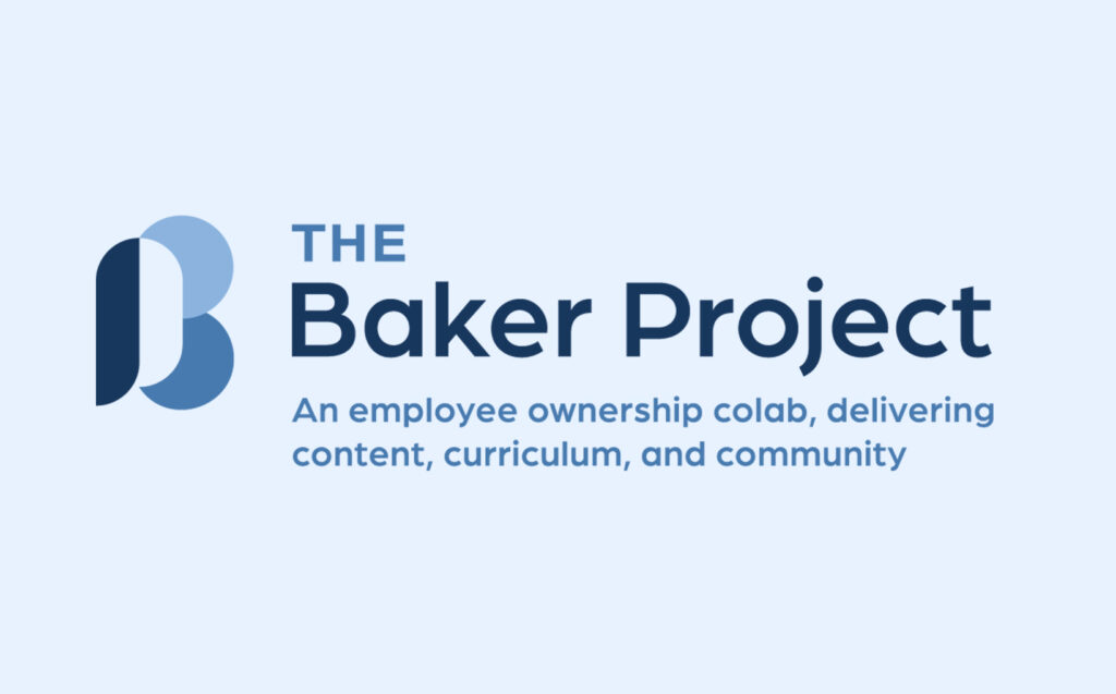
The chosen logo option for The Baker Project features a word mark with intentionally rounded typography to convey a sense of approachability to the organization. The accompanying icon plays on the idea of interconnectedness, using shapes that reference infographics and research to form a ‘B.’ Incorporated into the negative space of the icon is an abstract ‘P’ meant to resemble a speech bubble, as a nod to communication which is key to their work. The color palette is made up primarily of blues, a common color to convey calm and trust, as well as supporting greens, which symbolize growth and sustainability in the workforce.

Assets & Ongoing Support
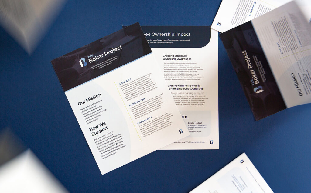
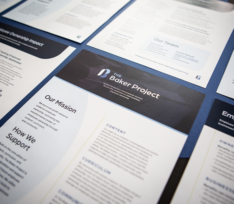
To aid in the launch of this brand at the national employee ownership conference, our team implemented both the verbal and visual guidelines we developed on a microsite and fact sheet to spread the word about the work The Baker Project is setting out to do in the world of employee ownership and business for good.
