Our Work
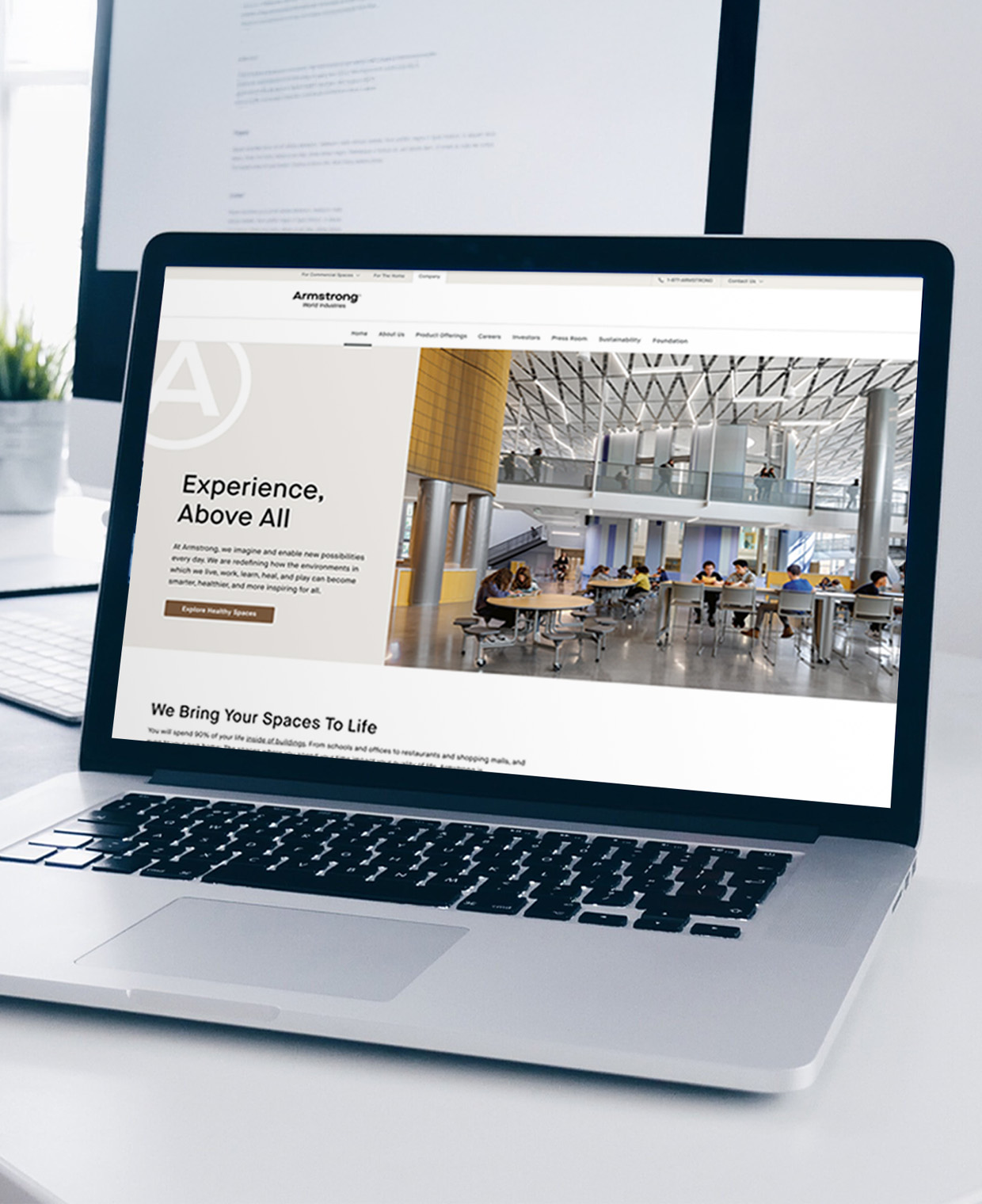
Armstrong World Industries
We partnered with Armstrong to enhance internal communications and redesign their corporate website—aligning touch points with their refreshed brand identity.
Digital Asset & Website Design Marketing Plans & Roadmaps Photography & Videography
Read more
Egg & Dart Books
Designing and launching Urban Legend, a book about C. Emlen Urban’s architectural legacy, began with establishing the foundation of Egg & Dart Books.
Brand Naming Digital Asset & Website Design Logo Design & Visual Identity Marketing Plans & Roadmaps Publication & Collateral Design
Read more
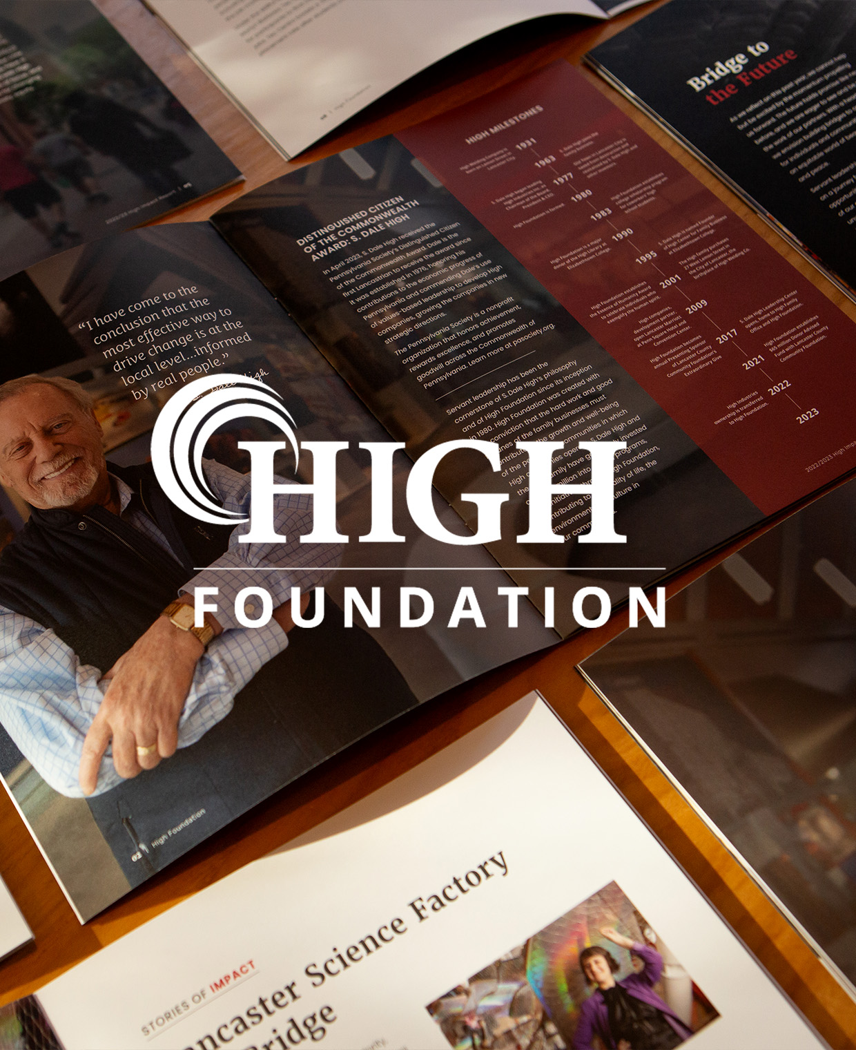
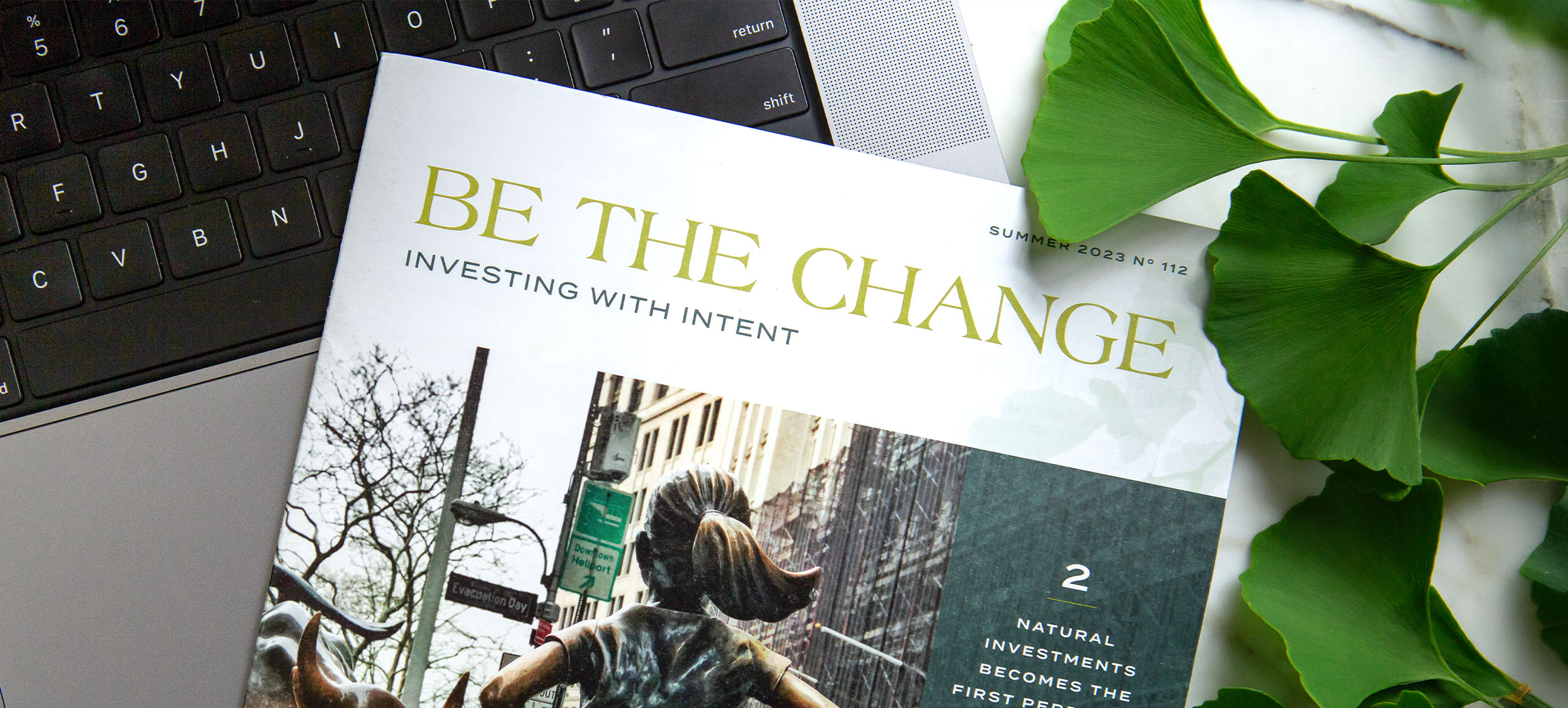
High Foundation
A longtime partner, High Foundation came to us for a strategic roll out of their new ownership model with continued work on their communications strategy and design.
Digital Asset & Website Design Messaging & Verbal Identity Photography & Videography Publication & Collateral Design
Read more
Tandem Center for Shared Business Success
Our team developed an intentional brand and strategic foundation to position Tandem as a leading authority in Direct Employee Ownership.
Brand Naming Digital Asset & Website Design Logo Design & Visual Identity Marketing Plans & Roadmaps Messaging & Verbal Identity
Read more
We elevate ideas, change perceptions, and transform businesses.
Discover How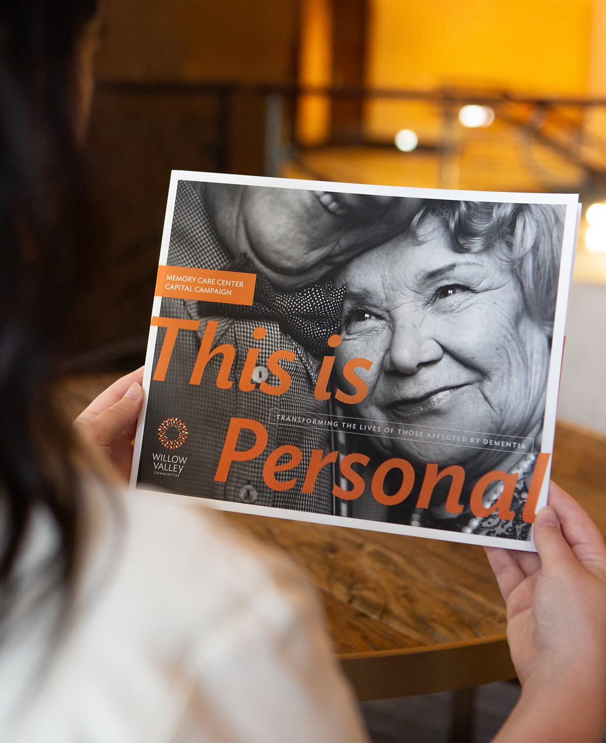
Willow Valley Communities Charitable Foundation
Willow Valley Communities Charitable Foundation tasked our team to craft a compelling campaign that would strengthen development efforts for a groundbreaking project.
Integrated Campaign Development Marketing Plans & Roadmaps Photography & Videography Publication & Collateral Design
Read more
The Baker Project
The Baker Project is a resource colab for employee ownership, which was named and branded by our team for a cohesive visual and verbal identity built on content, curriculum, and community.
Brand Naming Digital Asset & Website Design Logo Design & Visual Identity Messaging & Verbal Identity
Read more
Waltz Vineyards
Waltz Vineyard collaborated with us to elevate their brand through refining visuals and implementing strategic best practices.
Brand Refinement Logo Design & Visual Identity Marketing Plans & Roadmaps Messaging & Verbal Identity Publication & Collateral Design
Read more
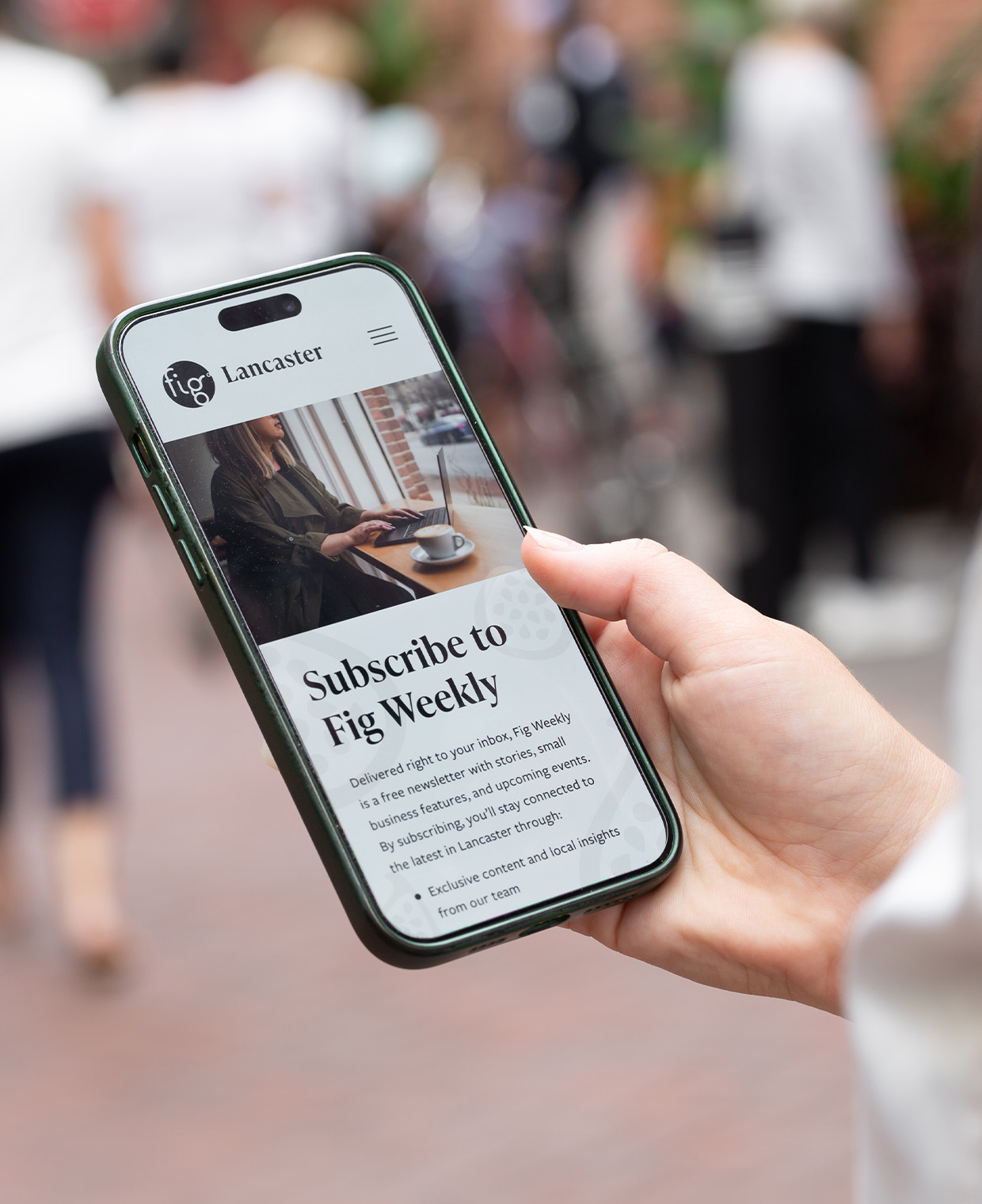
Fig Magazine Website
Fig Magazine—created by Fig Industries—launched a redesigned website to enhance user experience, refresh its content strategy, and reach more people with our mission to lift up all things local.
Copywriting & Editing Digital Asset & Website Design Marketing Plans & Roadmaps Photography & Videography
Read more